Hello, Mobile! Can we be friends?
Over the last year we've noticed that the percentage of users visiting our site on their smart phone or tablet has increased significantly. In fact, total combined usage has almost surpassed traditional desktop usage. However, with so many buttons and other small elements on the site, plus a complex navigation and non-dynamic text sizing, the site was not previously designed for ease of use on a moble device.
To address these and other issues, we have just rolled out a brand new version of YAP Tracker that will make usage on all sized screens much easier. Not only will you be able to access and track opportunities (which iPhone app users have been able to do on their phone) but you'll also be able to easily submit applications and do all the other things you are used to doing on the traditional desktop. In fact, you can even use the camera to attach an on-the-go selfie for your headshot - not that we recommend that ;)
For those on the desktop, you shouldn't notice a great many differences. We made a few tweaks to improve overall usability and cleaned up the design a little. We've included some before and after shots below when using a mobile browser (which now supports any mobile device, including Android phones and the iPad). We are very excited to share these changes and look forward to your feedback!
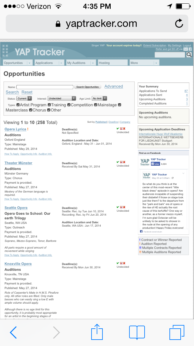
Opportunity list before:
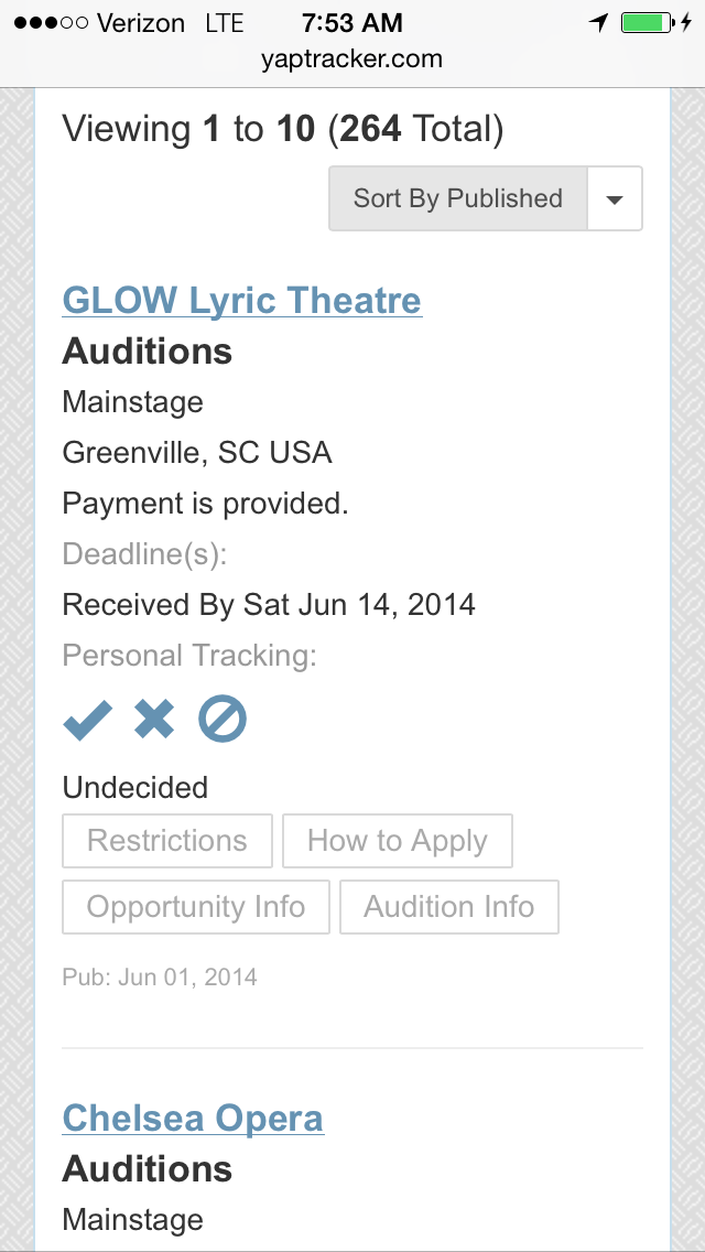
Opportunity list after:
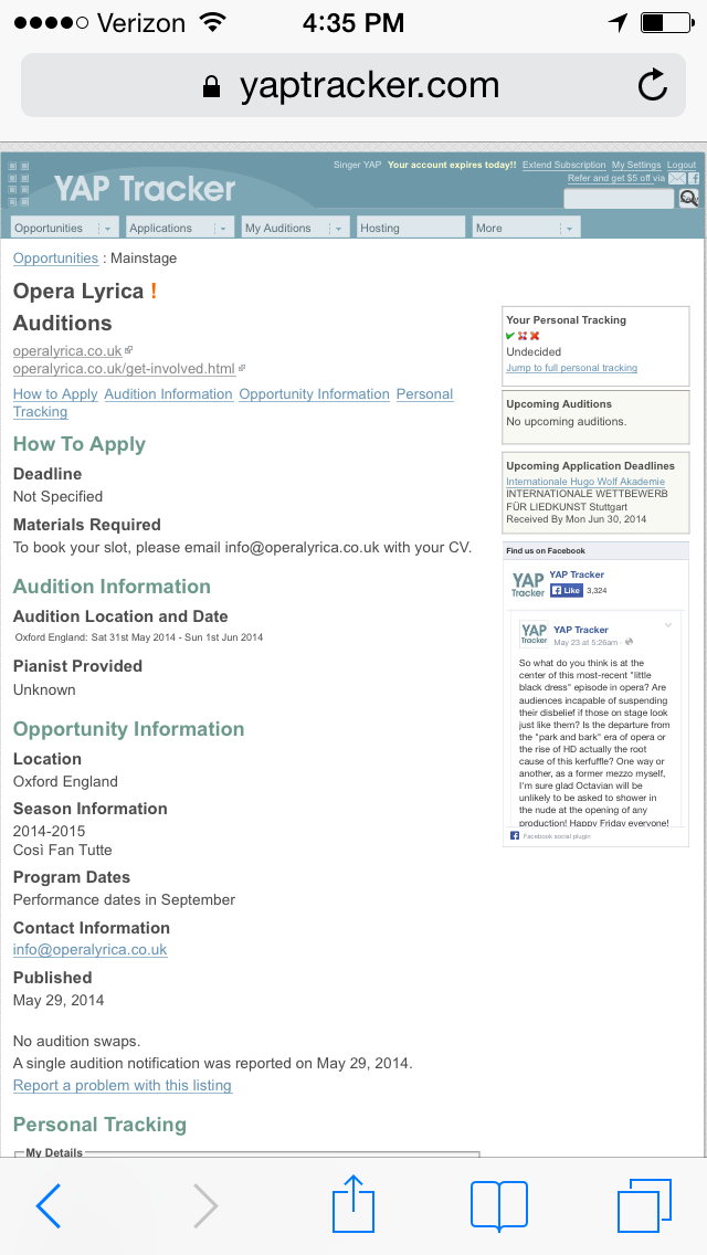
Opportunity detail before:
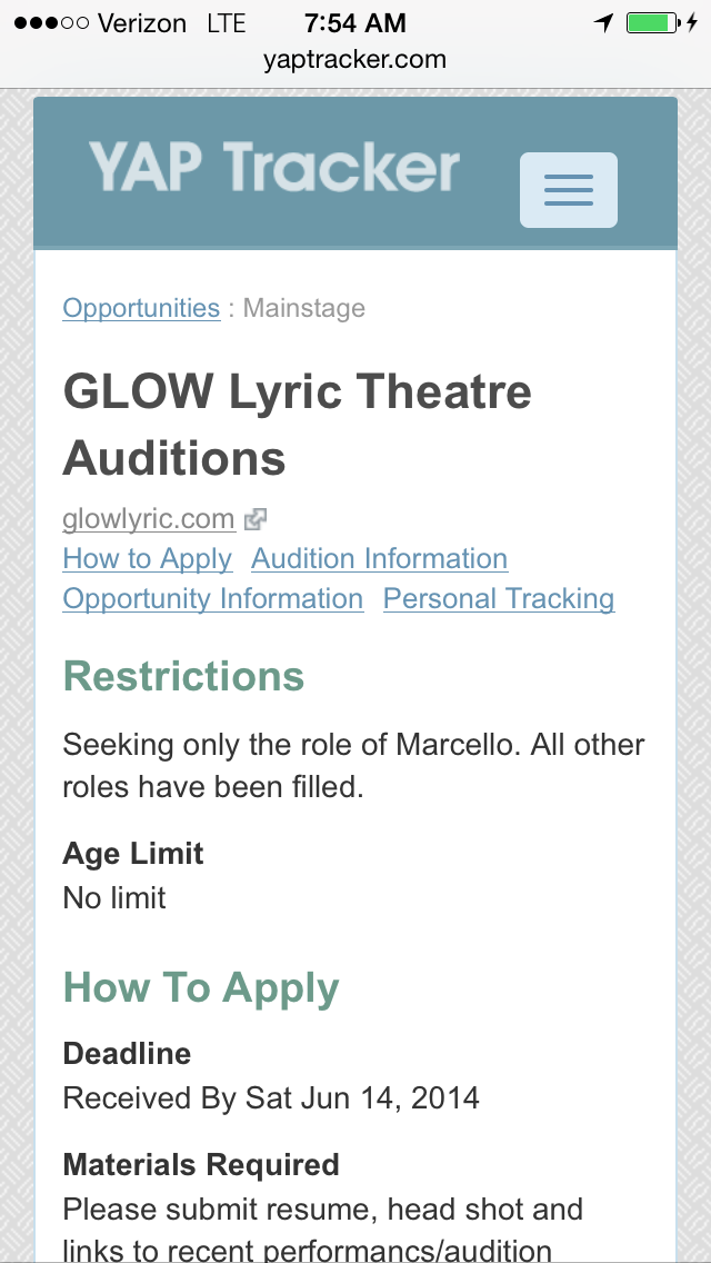
Opportunity detail after:
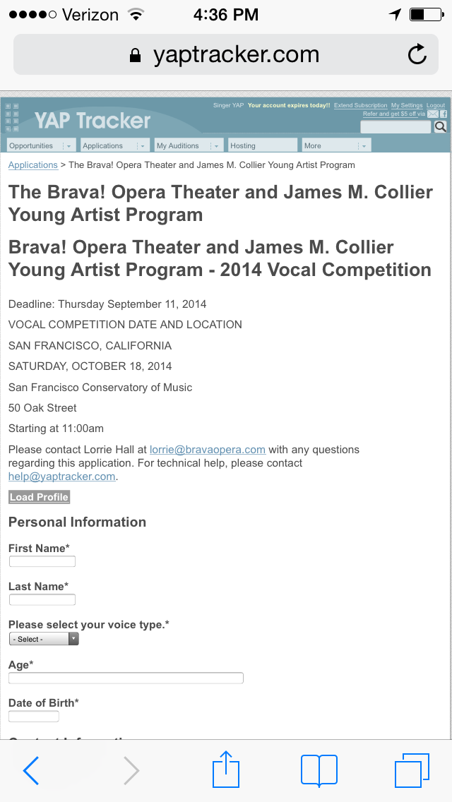
Application form before:
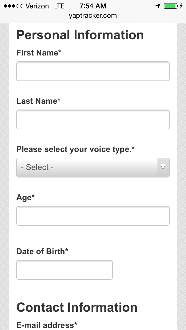
Application after:
Let us know what you think! Although our team spent a great amount of timing ensuring a seamless experience, there may be areas where something is amiss in the new system. Please be in touch if you find something that isn't working as expected, or just to share your feedback in genera.